
7 Useful Tips to Optimize Your Website and Boost Conversion Rates

Do you want to increase your conversion rates but don’t know how to? There are many factors that influence conversion rates. Fortunately, there are plenty of actions you can take to optimize your website in order to increase conversion rates. Many factors are at play and not everyone knows about them. We’ve made a list of tips you should use if you want to increase the conversion rate on your website.
Quickly go to:
TIP 1: REMOVE DISTRACTIONS
The first tip is to remove distractions from your website. Every visitor is a potential customer. You want to make their visit as easy as possible. You should remove any unnecessary distractions that might confuse them or scare them away.
An easy way to remove any distractions is to go over every element on your website and ask yourself ‘What would happen if I removed this?’. For instance, if an element only distracts the user and doesn’t help getting the visitor to click on your call to action button, then why leave it there? If you’re not sure if removing will be a wise choice, try to make the element smaller.
Choice paralysis – When adding too many steps or choices to a specific page or form, the user might get confused. This is called ‘choice paralysis’, which makes the user unable to make a decision. Where there is too much to choose from, where should the user click? You should make this very clear for the user and consequently lower the chance of the user leaving your website.
TIP 2: SIMPLICITY
This tip goes hand in hand with tip 1. You should optimize your website in a way that it is absolutely clear for the user where to click or go. You can achieve this by taking away all the workload that a user might possibly have. This means making it as easy as possible for the user to navigate to a page they are looking for, or a page where you want them to go to.
Above the fold – Keep conversion elements above the fold, meaning that your buy buttons or opt-in forms should be visible for the visitor on your page without scrolling. This makes it easier for the user because there is no need to scroll. Every unnecessary extra step a visitor has to take increases the risk of the visitor leaving the page.
One thing at the time – If you want your users to download your new free e-book, but you also want them to sign up for your newsletter, then make a choice. If you want to prevent people from hesitating, make sure it is absolutely clear what people should do on your page. This can be achieved to just have one single call to action button on your page, above the fold. Remember, less is more.
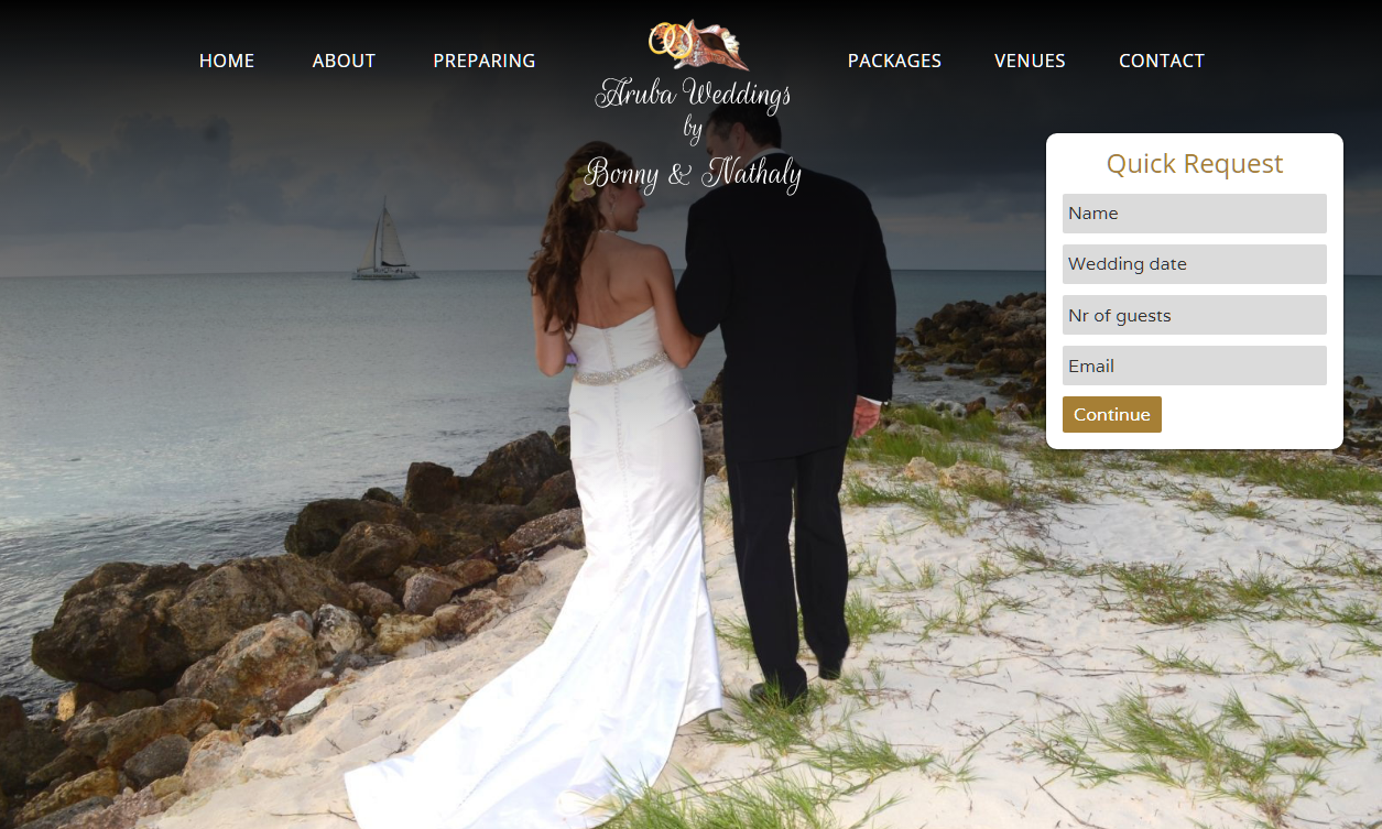
On the above website it is immediately clear what this website is about and what you need to do. There is no clutter or distracting element, just the opt-in form. Also all the needed information, in this case the opt-in form, is above the fold. The user doesn’t have to scroll down and find what they’re looking for. It is right there!
TIP 3: SOCIAL PROOF
When a potential customer is on the fence, social proof can be something that gives them that little push they need. Social proof is the phenomenon where people look at others who have tried or done something before, and use that as input for their decisions. Imagine two restaurants next to each other. Would you rather eat at the restaurant that is almost empty or almost full? Chances are you would choose for the restaurant that’s almost full, even though you don’t know anything about the two restaurants. You assume that the restaurant ought to be good because everyone is eating there. This is called social proof.
Testimonials and reviews – How often do you read testimonials or reviews before you book that hotel or buy that new TV? Do you buy that smartphone with a 4.5 out of 5 stars rating or the one with 2.5 out of 5 stars? The experience of other people can give potential customers a better feeling about the product and can prevent customers from worrying. The fact that other people have tried a product before and shared their experience can help potential customers to make a decision.
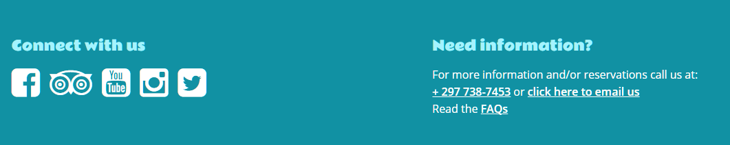
Social media – You can also create social proof by adding social media buttons to your website. When a visitor sees that you’re active on social media and have a decent following, it creates an idea of trust in the mind of the visitor. An example of correct use of social media buttons can be seen on this client’s website.
TIP 4: COLOR
The colors you use on your website can make a big difference. If your website is full of screaming colors, how are users going to find your call to action button? The key here is to find a good mix of soft and strong colors.
The users of your website have different feelings with different colors. For example, blue is often used on government or law firm websites. In this case, blue gives the user a feeling of trust. On the other hand, red can be a screaming color that would be effective for sales buttons. Test what works best for your website and don’t be afraid to change existing colors. The balance between colors on your website is of great importance.
TIP 5: BE CLEAR AND DIRECT
On your website you want your communication to be clear and direct. Simplicity is more effective than trying too hard to impress your visitors. You want it to be clear for your customers what they are supposed to do on your website. You don’t want them to scroll and click around to find what they need, if they can even find it that way.
Language – Use active language on your website. Call to action buttons should also be catchy and strong. Think about buttons such as ‘buy now’ or ‘sign up’. Try to prevent text to be too long and general. Try to think of it as the same way you should look at removing distractions from tip 1, remember? Every word you put in your call to action button should contribute to the message. If a word doesn’t fit, remove it, change it up.
Direct – What you can also try is to talk directly to your users by using the word ‘you’. This is more direct, clear, and makes the user feel more important. Don’t let your users guess what you mean. You want them to know exactly what you have to offer.
TIP 6: HEADLINES
The very first thing people notice is your headline. Often times, people finalize their blogs, quickly come up with a decent sounding headline and just use that as a headline for their new blog. This is not how you should be approaching the creation of headlines. Sit down, brainstorm, brainstorm some more and make a good collection of potential headlines for your blog.
Emotion – Something that works well is to add a sense of emotion in your headline. When using strong emotional words, it creates a sense of empathy in the mind of the reader. It also grabs the reader’s attention and interest at the same time. This increases the chance of the reader actually clicking and reading your blog.
Curiosity – What you can also do is to try to trigger curiosity. You can achieve this with leaving out one detail that the reader wants to learn more about, or make your headline a question. This makes the reader curious and could result in a click, which is what you are aiming for.
Ideas – If you are facing writer’s block on headlines, you can always try a headline generator online. Those generators do not always produce accurate headlines, but can be fairly effective if you’re out of ideas. A headline generator that might be useful is Hubspot’s headline generator. Even though you do not always get decent headlines out of such generators, you can still edit them or take certain elements and create your own original headline.
TIP 7: TEST, TEST, TEST
The last tip is to test. This is one of the most important things you can do on your website. How else would you know what works and what does not? It is important to keep track of the effectiveness of changes you’ve made to your website.
A/B testing – One of the things you can do to test what works best for your website is A/B testing. This means that you create two different versions of a headline or a call to action button. Let’s say you want to test different variations of your call to action button. Your current button contains the text ‘buy here’ and the color of the button is blue. Measure the activity on the page of your call to action button before you make any changes. There are several ways to test and track the performance of elements on your website. For example, you can use Google Analytics as a tool for A/B testing.
You want to keep measuring until you have enough data that is representative of the activity on your page (in this example, two weeks). After two weeks, you change the color from blue to red and keep this on your website for another two weeks. After that, you can compare the tracked data to see if there is any difference. You can of course go back and change the text of the button as well, but make sure you change as little as possible every time you want to do an A/B test. This is because if your data shows a significant increase in clicks on your call to action button, but you changed the color, the text and the size of the button, you won’t know which element caused the increase in clicks.
Split testing – This is the same concept as A/B testing, only you create two different URLs for your landing page, for example. This can work well with advertisements. 50% of your targeted audience will get to see version A of your landing page and the other 50% will get to see version B of your landing page. In turn, you can measure the activity on both pages and see what worked best for your audience. For example, version B showed a 20% higher conversion rate, you can go from there and split test variations of version B the next time you’re making advertisements to increase your conversion rate even more.
If you use these tips for your website, you have a serious chance of increasing your conversion rates. Do you want to optimize your website and increase your conversion rates but don’t know where to start? Please contact us! We are more than happy to help and assist you to maximize your website’s effectiveness!

Sorry, the comment form is closed at this time.